OXO
- Retail+eCommerce
- HomeFurnishings
- Food+Beverage

oxo.com — An eCommerce experience that acts as an extension of the brand’s founding beliefs.
View live siteChallenge
OXO is an award-winning houseware manufacturer that emerged out of necessity. Determined to find comfortable kitchen utensils for his wife with arthritis, Sam Farber devised a line of products to bring ergonomics to the forefront. And so, OXO was born.
Founded on the premise of creating better everyday products every day, Farber sought to upend the generic by making OXO’s name synonymous with convenience, innovation, and, above all, great design. With this mission in mind, the OXO team came to us to help them design and build a new eCommerce website.
Approach
We set out to bring OXO’s brand mission to its new eCommerce experience. Through data-led research, iterative design, and robust technology enhancements, we crafted a flagship site that delivers a seamless and unified digital experience, making product presentation more human and aspirational.
Our platform also integrated content and enhanced the brand’s discoverability by turning its Good Tips blog into an inspirational shopping destination that is as intuitive, intelligent, and ergonomic as the OXO products, themselves.
EXPERIENCE STRATEGY
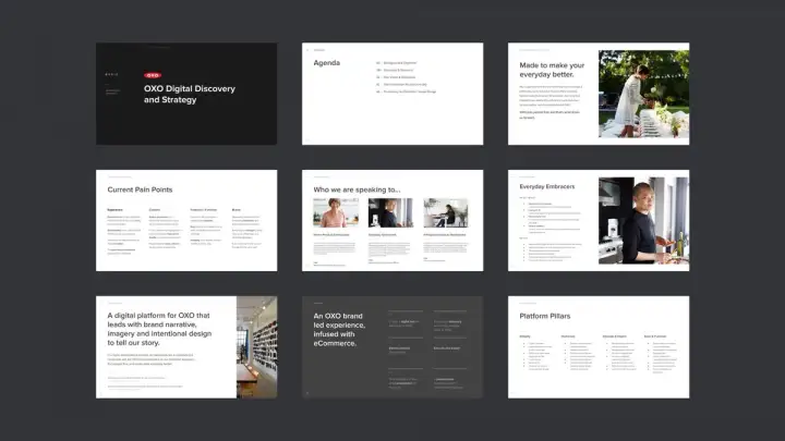
We spent a lot of time with the OXO team learning about their brand and its ambitions. We worked with them to identify their audience, understand current pain points, gather insights from analytics, and help refine their positioning to establish a framework for differentiation on the site.
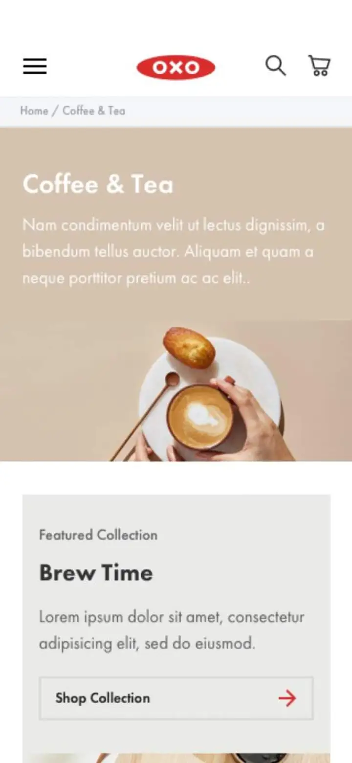
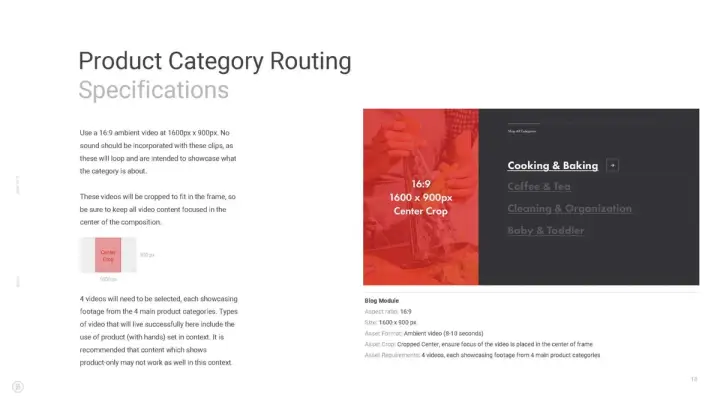
With over 3000 SKUs, the site structure and taxonomy were essential to simplifying the user experience. We established an architecture and merchandising strategy based on four major categories and with clear subcategories to better route users to relevant content and products.
EXPERIENCE DESIGN
Our experience design approach was three-pronged. Throughout the experience, we wanted to focus on simplicity, education, and convenience. Our goals were to build brand awareness, encourage engagement, and drive conversion—all the while keeping these principles top of mind.
Building a best-in-class eCommerce experience for mobile.
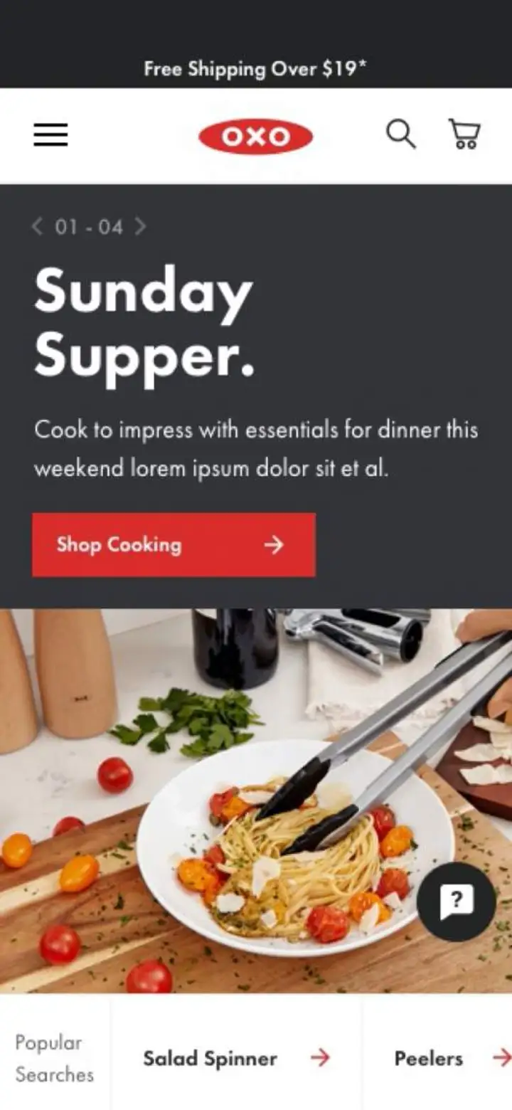
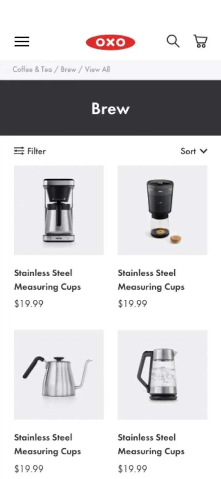
A best-in-class mobile design was critical in bringing the brand forward. We were intent on streamlining the experience and expediting the path to purchase by meeting the users wherever they are, whether on a blog post or the product listing page.
The site’s experience design relies on visual content, simple utilities, and engaging interactions to stand out and align with today’s consumption habits.
Creating a flexible system to enrich product presentation.
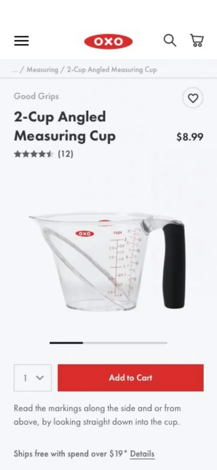
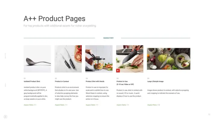
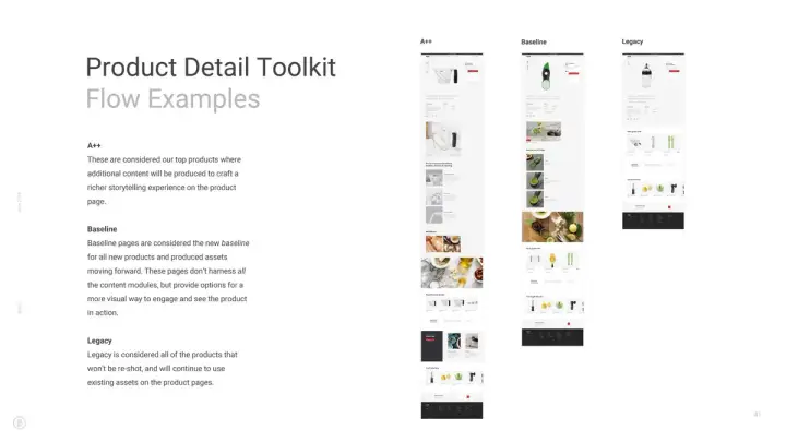
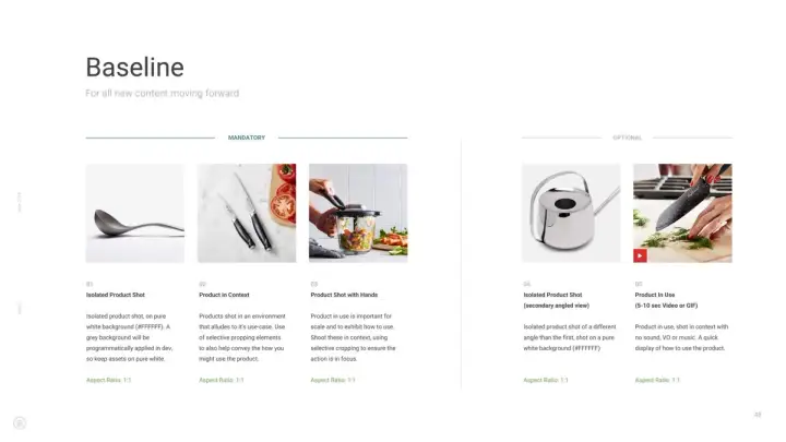
With over 3000 SKUs across a wide range of categories and applications, the product display pages needed to be flexible enough to highlight each product’s proposition and simplify content management for OXO’s internal team. Through a modular and adaptable system of components, we designed product detail pages that bring product information, cooking inspiration, and robust shopping features to users.


Establishing a design framework for improved discovery.
The digital experience is as ergonomic as the products it sells, with OXO’s offerings and value propositions centerstage at all times. Throughout the experience, there’s a mix of personalized content and shoppable moments. Users can easily view products, make purchases, or simply find OXO’s latest cooking tips and recipes in the comfort of their own kitchens.


Overhauling content strategy with the Good Tips blog.
Improved conversion was a mandatory ask from the brand team but so, too, was storytelling. One of the site’s most distinguishing features is the deep integration of content and commerce to drive engagement.
The previous blog was hosted on a URL separate from OXO.com, and the OXO.com eCommerce platform lacked captivating content. We consolidated the experience and facilitated this process by creating a single, two-way shoppable destination that put storytelling at the center.


DESIGN HANDOFF
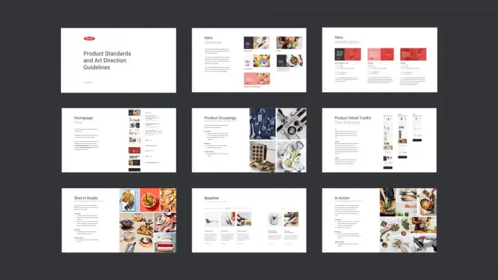
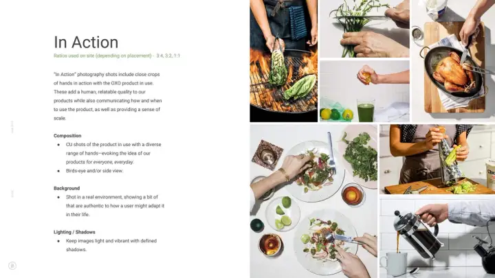
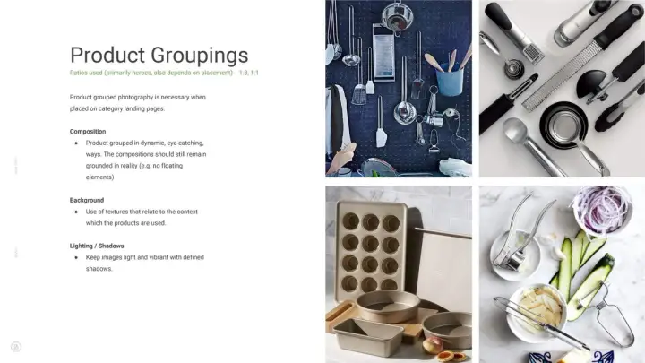
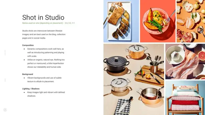
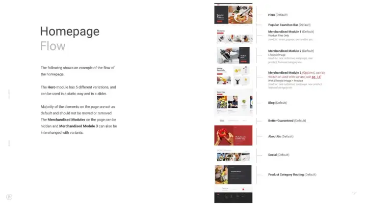
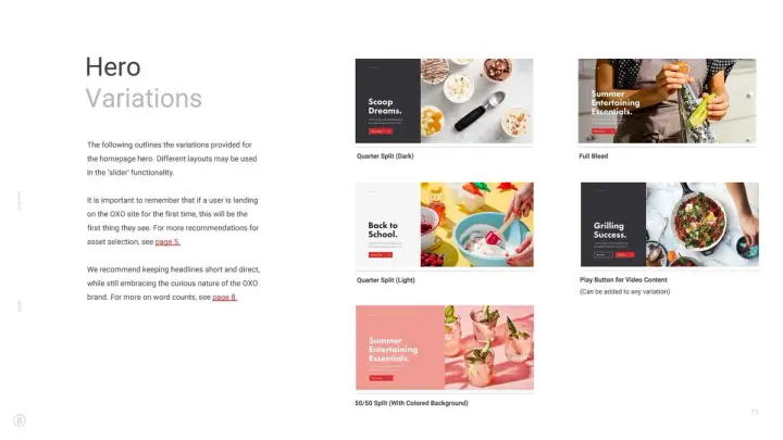
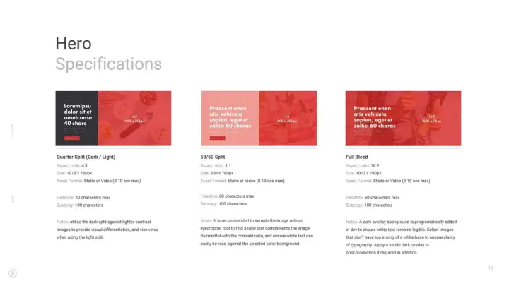
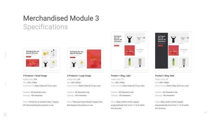
We provided OXO with extensive documentation that outlines guidance for art direction, content production, and site management. Our guidelines provide clear direction on maintaining content strategy, visual standards, and the system of components across pages and templates.
RiotGames
- Entertainment+Gaming
- Software+Technology
RiotGames
- Entertainment+Gaming
- Software+Technology

