Vainglory
- Entertainment+Gaming
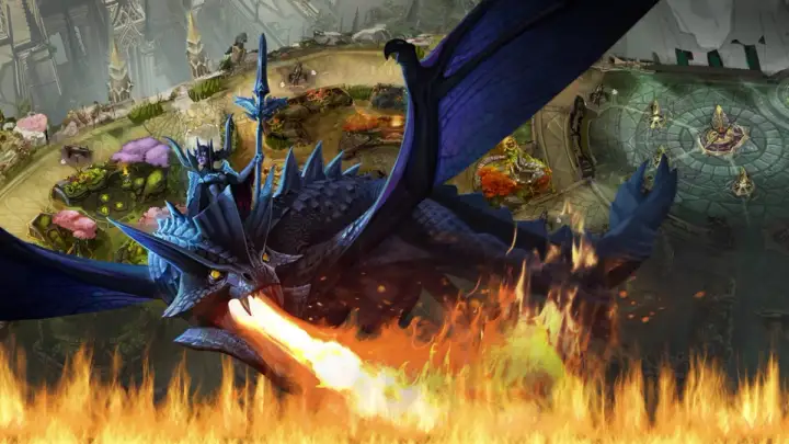
vainglorygame.com — Building a platform to connect Vainglory with their growing community.
Background
Vainglory, from Super Evil Megacorp, is the first MOBA (multiplayer online battle arena) platform made for mobile and perfected for touch. Touted by Apple as having built the best gaming graphics engine on iOS, Vainglory wanted to grow its 1.5 million monthly user community with its upcoming Android build and launch.
We were brought in to refine the Vainglory brand and build a new Vainglorygame.com. Together, we established a strategy to realize its brand ambitions of better engaging and serving users, creating a flexible and consistent design system across its brand marketing efforts.
Accolades/Press
- The Webby Awards — Nominee — Gaming — 2016
Experience Design
Our digital experience complements the aesthetic detail and nature of exploration of our subject: the game. With inspiring design, new players enter the game, casual players learn more, and dedicated players explore the game’s layers and community.
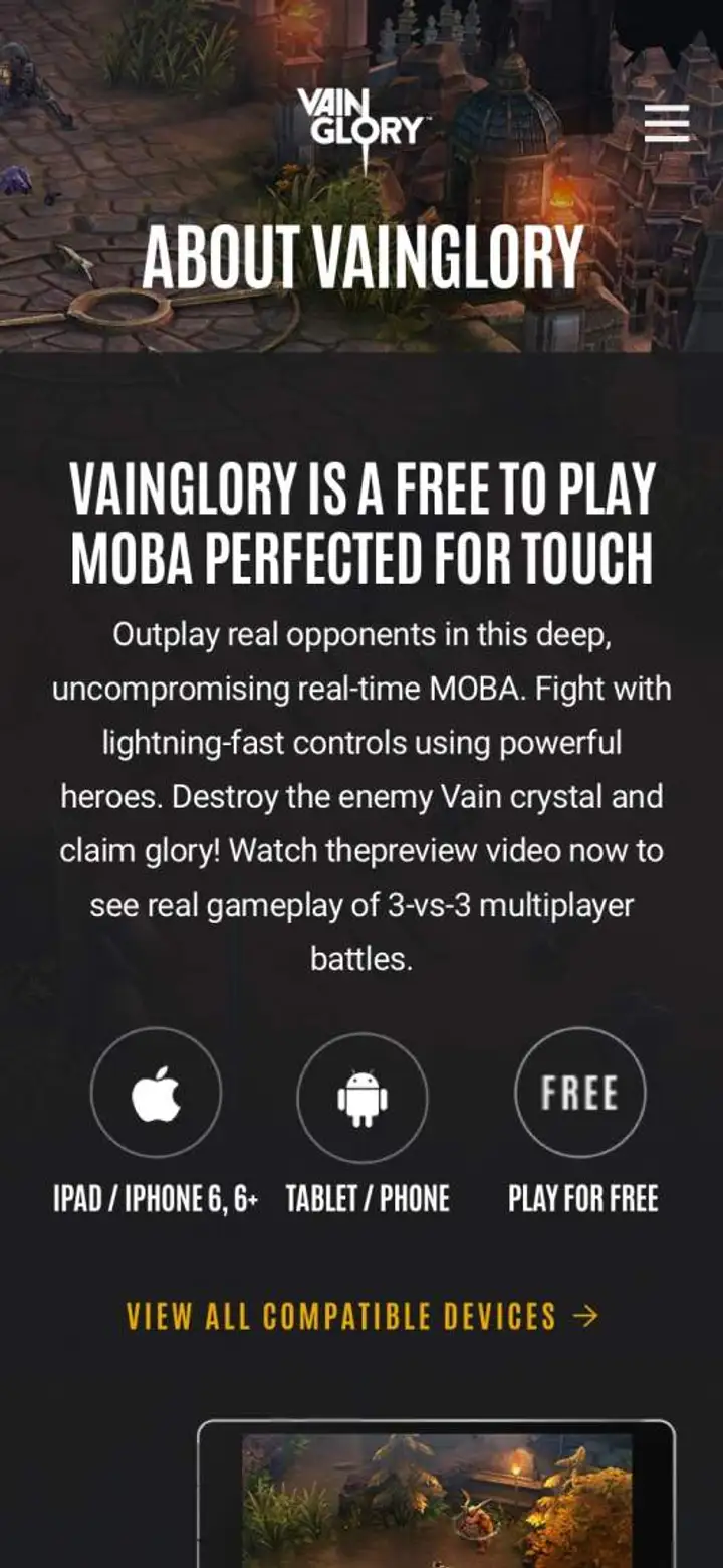
A mobile site experience for a mobile game
Research taught us that 85% of traffic arrives through mobile; the design is suitably ‘mobile first,’ featuring touch gestures that match the in-game experience and improve the discovery-based browsing experience.
For the UX, our mobile strategy simplified content and made navigating between pages and sections much easier on mobile, tablet, and desktop devices. For each form factor, we adapted the responsive functionality and overall design aesthetic to drive business as well as meeting user expectations on usability and load times.
Designed to bring the game to gamers.
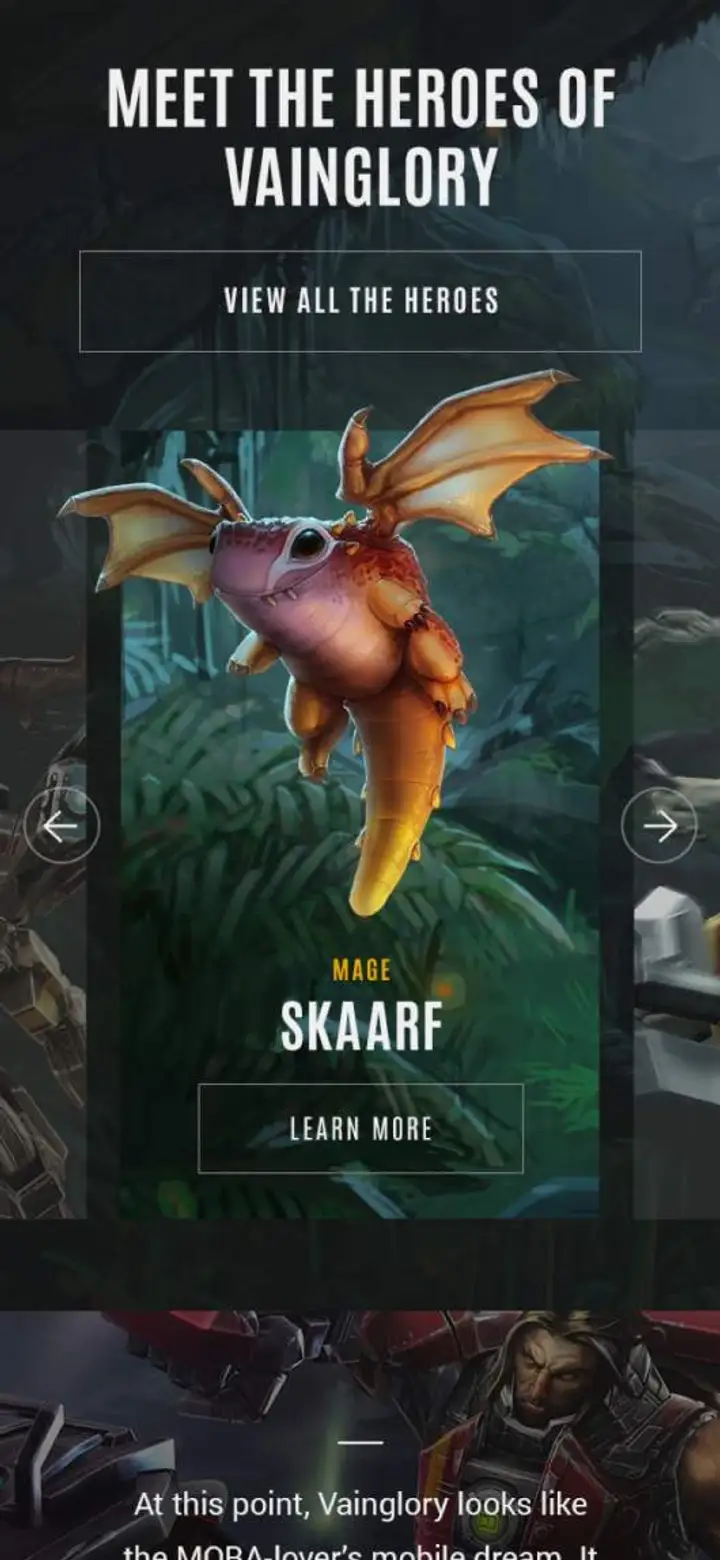
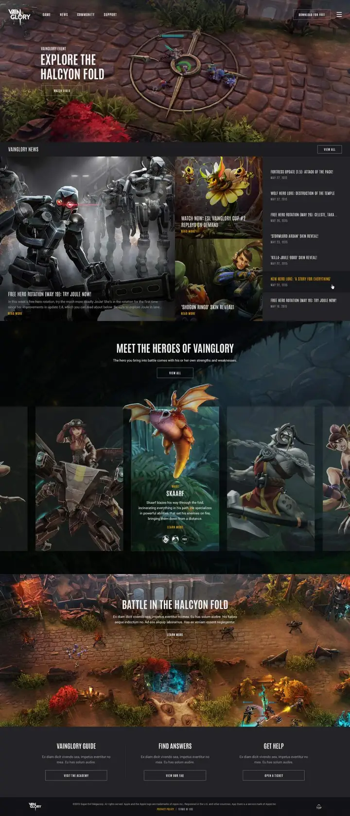
Our Vainglory design structure is highly adaptable for its content needs, presents the true nature of the game aesthetics, and provides players with a framework that allows impactful imagery and video highlights to inspire action.
Creating connections through content and architecture.
Our work is always a true reflection of the brand and its unique appeal. This is how we create authentic and lasting impressions between a brand and its audience. The pages of the Vainglory digital platform are treated as portals, through which both new and loyal players are encouraged to explore and discover content. Cross-linking and related content strategies improve the UX for SEO.


Telling character stories to deepen engagement.
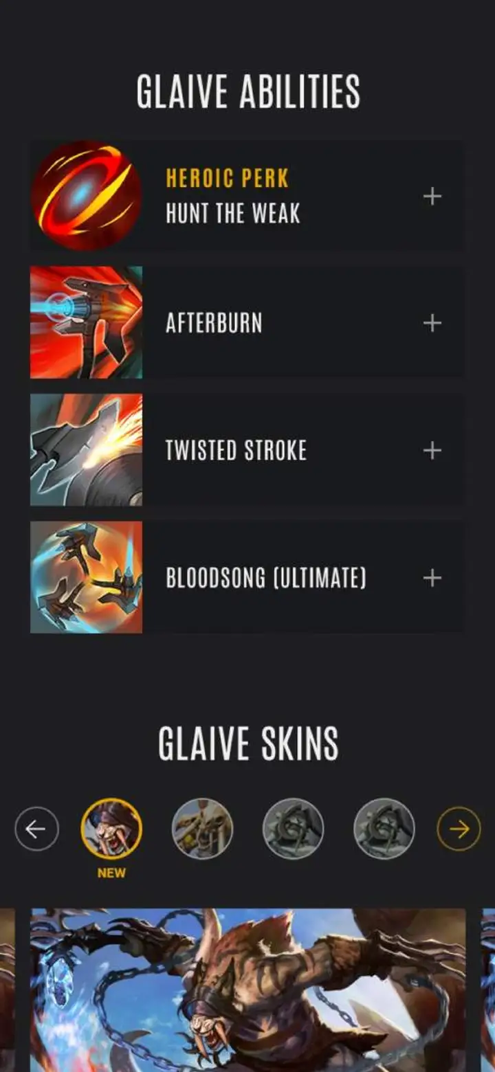
Choosing a character is a decision the Vainglory player doesn’t take lightly, and their character plays an important role in the overall ongoing game experience. It’s also a key revenue generator, so we worked effortlessly to bring the online characters to life and establish defined standards for presentation and consistency.
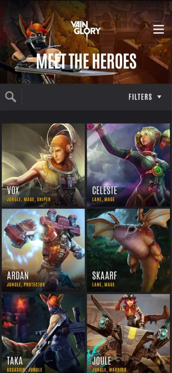
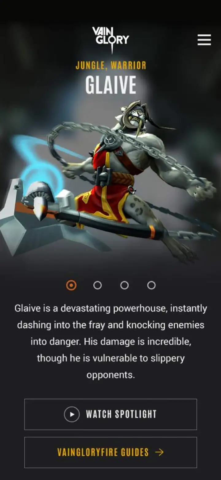
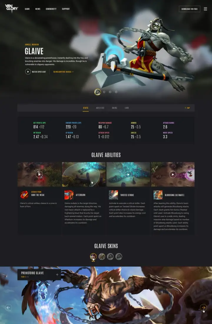
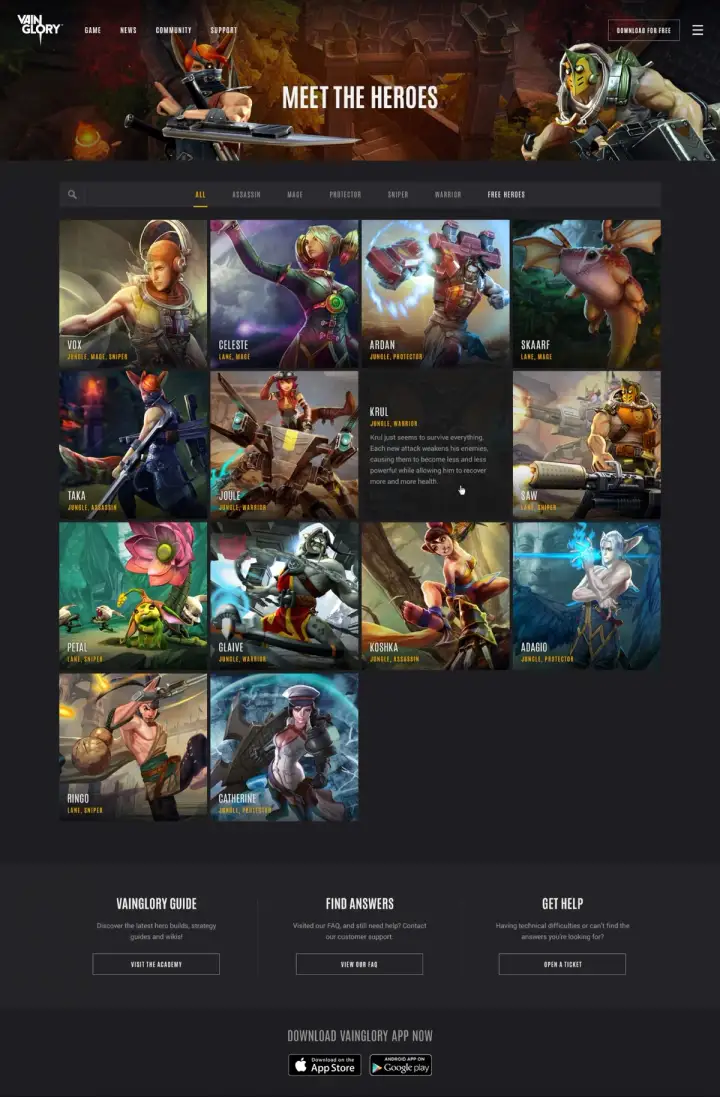
The character section of our site makes options easy to discover and filter. We designed visually-driven character landing pages that present all character options while enabling Vainglory to push frequent updates, such as skins, new releases, and other information. The character detail page uses a framework that enables the players to immerse themselves in a character’s personality, strengths, and weaknesses. Content sections highlight large hero graphics, statistics, and other details that inspire selection.
Building the Vainglory community.
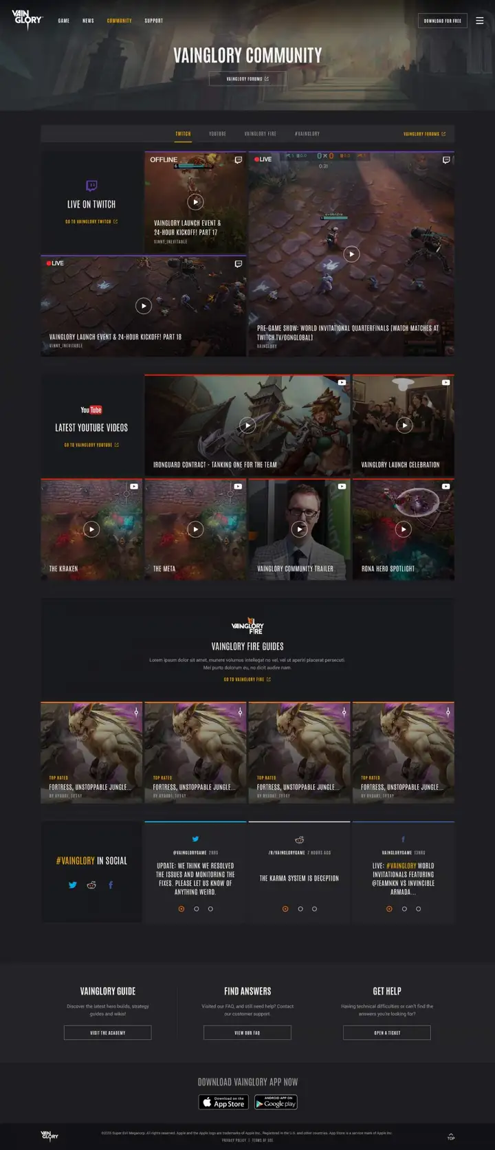
Community content is heavily leveraged on the new platform through an aggregation portal to connect players with one another and build a vibrant society. Reddit, Twitch, YouTube, Vainglory forums, and other social outlets are pulled together within a centralized stream, providing users with a utility to view ‘live’ Vainglory content.
Connection was key in our strategy, but it was just as important to show new players just how large and evolved the connected community is, to encourage them to join, and to reward them for their loyalty.
Volcom
- Fashion+Apparel
- Retail+eCommerce
Volcom
- Fashion+Apparel
- Retail+eCommerce
