DesktopMetal
- Electronics+Hardware
- Software+Technology
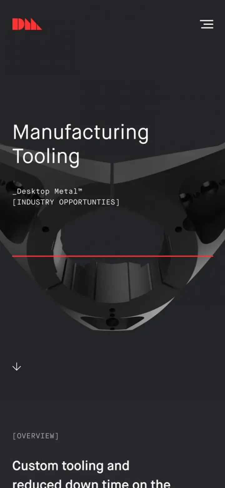
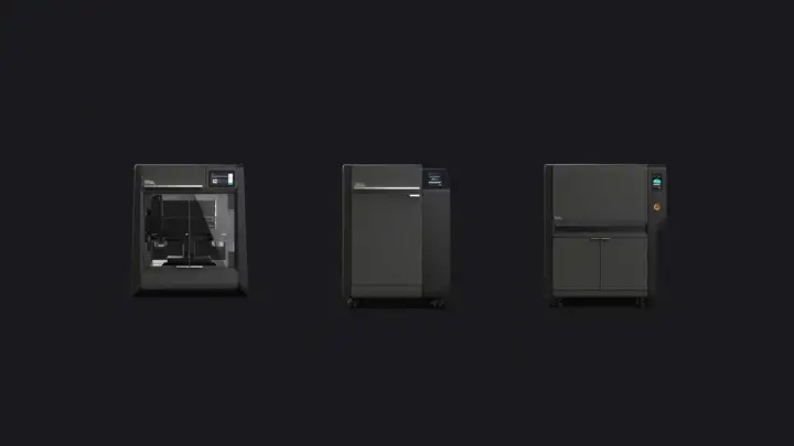
desktopmetal.com — A digital rebrand that visualizes the future of manufacturing through 3D printing.
View live siteChallenge
Desktop Metal was founded by visionaries in advanced manufacturing, metallurgy, and robotics. Its mission is to reinvent the way engineering teams produce metal and composite parts. As the world stands on the verge of the next Industrial Revolution, rapid innovation of 3D printing is a key driver in our collective future. Our challenge was to shift the perception of the field from an emerging industry to a necessary component in the future of manufacturing.
The company had a world-class team but a website that was difficult to navigate, so our goal was to create a digital experience that’s simple to use and accessible to all.
Approach
Before our collaboration, the brand found success with its in-person sales process but struggled to translate this experience to the digital space. Our focus was to establish a robust design system, content strategy, and simplified site architecture derived from its face-to-face customer interactions.
Through an immersive and strategic design exercise, we harnessed storytelling, reimagined navigation, and brought contextual examples to life—surfacing opportunities for a diverse audience of both massive companies and hobbyists. Our new experience serves up relevant content, demonstrates what’s possible, and gives users the ability to scan details at a high level or dive deep.
Design Direction
We elevated and codified the existing brand with a digital-first approach and defined how the design system can stretch across the entirety of brand touchpoints, from digital to physical.
Ultimately, we created a comprehensive visual language that gives the brand legs and helps differentiate it from the competition. In a world where information is vital, Desktop Metal stands out with an aesthetic that captures its depth of knowledge in a simple, beautiful, and structured grid.
Romancing the beauty and precision of 3D printing.
We developed a familiar type and color system inspired by technical ephemera—speaking to our audience and creating a familiar aesthetic that demands trust. We paired this system with a meaningful interaction model that guides users seamlessly through the experience.
Experience Design
In our immersive on-site kickoff with the team, it was clear that we had to achieve a few main objectives for their business: complement their sales channels, enable future product expansion, and build relationships with current and potential customers.
We learned that the sales team achieved results by showcasing their deep, industry-specific knowledge and putting the parts in clients’ hands. These core insights guided our strategy. We wanted to demonstrate how the products fulfill the needs of potential customers while bringing the company’s culture and categorical expertise forward.
Contextualizing navigation and facilitating product discovery.
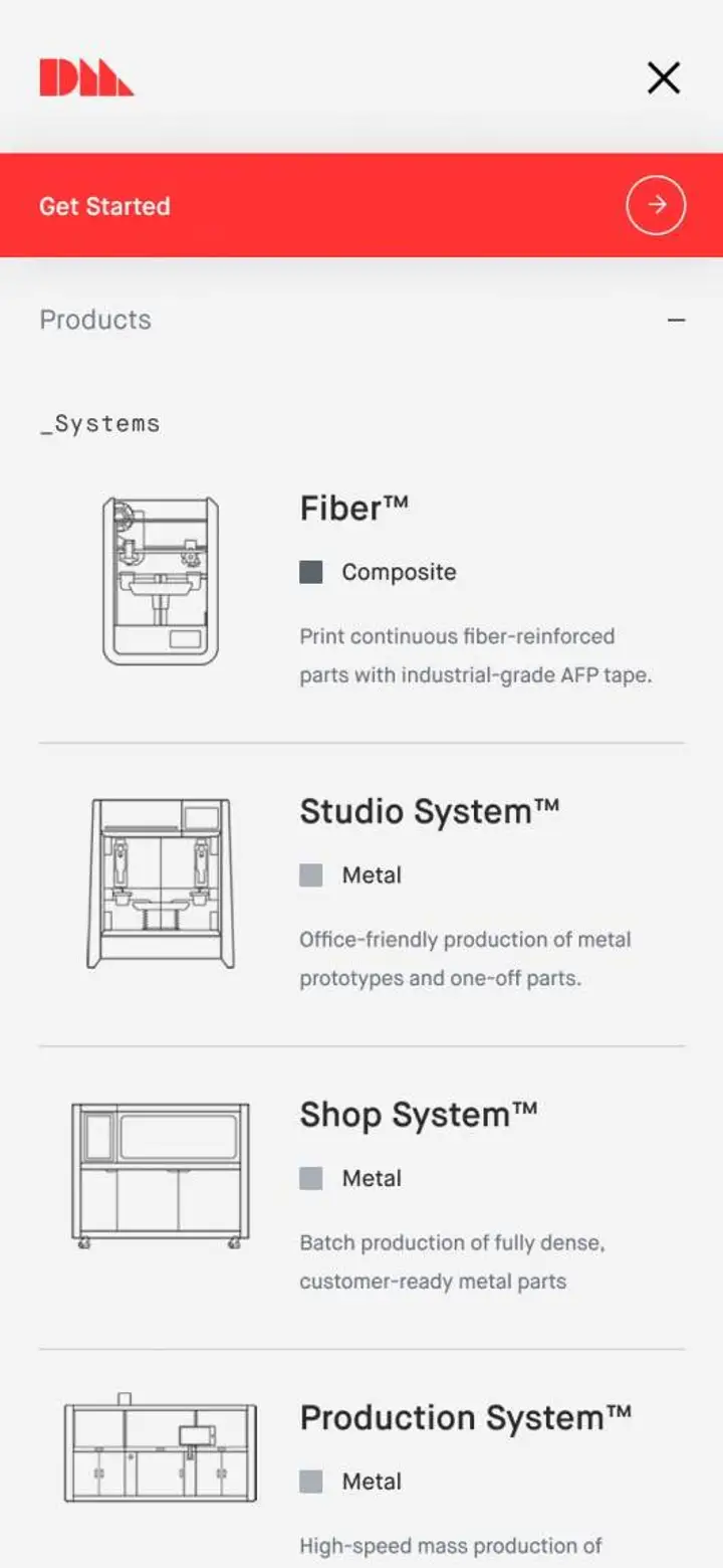
Research led us down the path of delivering an educational experience through an intention-based method of product navigation. This approach offers clear and unique paths for user education that are product-specific (micro), industry-specific (macro), and correspondent to the resource center (micro and macro).
Contextual information.
Speaking to a broad range of audience segments meant creating a system that gives entry-level consumers the information they need. It also allows knowledgeable engineers the ability to dive deep.
Sales tools.
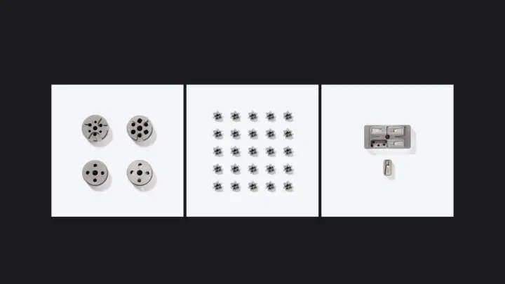
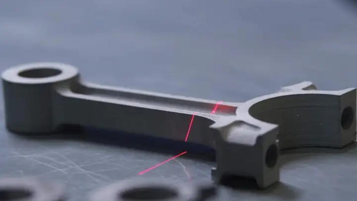
Some of the main sales tools used by the DM team are the physical parts that the machines print. They have cases of these that they carry with them and showcase at expos, helping bring a level of clarity by showing what can be printed as well as the fidelity of the end product.
Making product pages as immersive and innovative as the products.
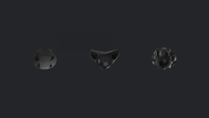
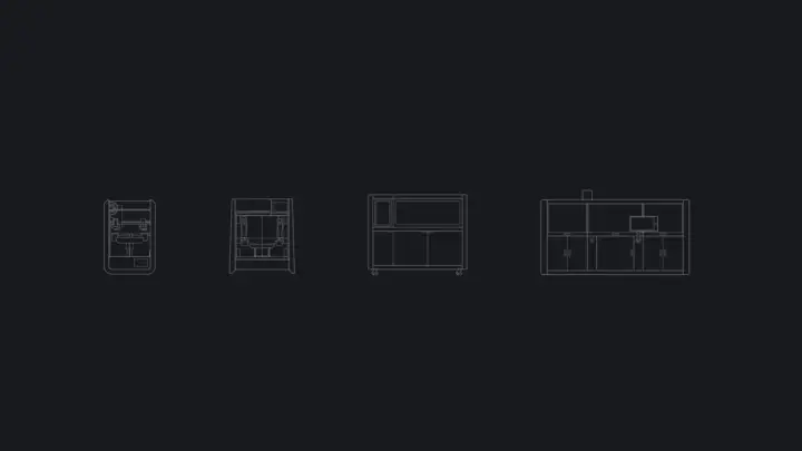
We reimagined the content flow of the product detail pages to better explain the offerings at a comprehensive level. They allow users to scan key features and dive deep into fine details. Our immersive modules highlight benefits and value propositions while serving users engaging and valuable content—an industry-leading blend of 3D, video, and expressive stills.
Showcasing the breadth of what’s possible.
Paired with our immersive product display pages, we developed a system for the team to showcase the application of their products' output through their impressive roster of clients. The content adapts and delivers relevant information, allowing our users to make informed decisions. From cost savings to an in-depth parts wall, we help build trust through application and context.
Educational resources that adapt to every user.
We reimagined the resource center to become a hub of 3D printing inspiration and educational storytelling. The page adapts to a variety of user types, from users looking for general information to those in search of detailed and specific data.
To enable thought-leadership at scale, we created a single article toolkit that flexes across content needs, from short-form articles, videos, and whitepapers to in-depth case studies enabled by a flexible CMS.


Telling the rich history of 3D printing to bring Desktop Metal’s ambitions forward.
The history of 3D printing is storied, inspirational, and always progressing. The experience reveals what drove the founders to create Desktop Metal and how they envision the future.
Content Direction
In close collaboration with various teams, we helped define the art direction for 3D content, video, and expressive stills that were executed by 3D modelers and animators at Midnight Sherpa. Together, our vision was to craft an experience that’s both beautiful and educational. The result is an ownable branded experience as visually exciting and detailed as seeing the products up close.
Technology Solutions
The site was built on Craft 3.0, the newest version of Craft CMS. It is one of our preferred CMS platforms for its speed, administration interface, and flexibility—making the build manageable for Desktop Metal’s retained development partner.
We combined technology from our custom Webpack technical stack with best practices for Craft 3.0. This enabled us to test stability and gave us the freedom to build custom modules, interactions, and animations.
Site speed matters and immersive, visual, and content-rich sites still have to perform.
We built a custom code stack using Webpack and Babel that provides us with the ultimate amount of control over design, animation, and interactivity without fighting an opinionated platform or forcing users to download unnecessary features. This solution enabled us to maintain site performance and maximize our deliverables without degrading the content and visual appeal of the experience.
Content-rich sites require user-friendly and robust content administration.
Because the site was built with modules containing complex, nested interactive content that often needed to be repurposed on multiple page templates, content management risked becoming time-consuming and obtuse. We worked with the internal teams at Desktop Metal to test multiple approaches of module administration and developed a streamlined technique leveraging Craft presets.
Similar to an atomic structure, complex modules became composed of any number of presets. Individual presets represented smaller blocks of information, such as text, forms, buttons, and media as well as custom product details. Presets were categorized and saved with the ability to be browsed, edited, cloned, and managed in bulk. This system provided flexibility and control from content population to page creation and publishing.
DesignWithinReach
- Retail+eCommerce
- HomeFurnishings
DesignWithinReach
- Retail+eCommerce
- HomeFurnishings
