JeffKoons
- ImmersiveExperience
- Web3

JeffKoonsMoonPhases.com — Tailoring a celestial site for a lunar gallery.
View live siteCHALLENGE
Pace Gallery’s Web3 innovation hub, Pace Verso, tapped BASIC/DEPT® to design and build a digital experience for iconic American artist Jeff Koons’ first-ever foray into the NFT space. Inspired by the moon, Koons created “Moon Phases,” a collection of sculptures and NFTs celebrating human achievement both past and present. The project invites viewers to reflect on their place in space, with 125 sculptures inspired by influential historical figures sent—literally— to the moon via a partnership with SpaceX, while 125 corresponding replicas are available for purchase here on planet earth, each with their own NFT counterpart for art collectors to enjoy.
We needed to bring this out-of-this-world exhibit into the homes of people around the world, and easily communicate its highly complex concepts in ways that made it relatable to every visitor.
APPROACH
We worked closely with the team at Pace, as well as Jeff Koons himself, to ensure the site was more than just a promotion of the exhibition; it had to be authentic to Mr. Koons’ vision. We envisioned the site to be an immersive gallery that served as an extension of the artwork itself, augmenting the project for collectors lucky enough to own a sculpture; and making it accessible for everyone else.
And much like the moon has phases, we too launched the site in three parts to ensure it was true to the art and accessible to everyone.
Moon Phases communicates that people are the carriers of what is truly meaningful to us in life.● Jeff Koons
META/PHYSICAL SITE EXPERIENCE
Just as Mr. Koons blended the metaphysical world of NFTs with our own tangible reality, we began conceptualizing the site by looking to marry the digital and physical worlds. We thought about everything from leveraging ambience to evoke being on the moon, utilizing haptic feedback gloves so viewers could feel the sculptures, and even AR experiences that brought the lunar exploration into viewers’ homes.
But we ultimately found inspiration from the artist himself, opting to create an experience both immersive and stunning in its simplicity.


THE TEASER SITE
We worked closely with Pace to art-direct a teaser film for the splash page, and launched a minimalist site that featured a mysterious short video of Mr. Koons teasing his upcoming exhibition. The intention: to inspire viewers to come together and postulate through a dedicated Discord channel created for the exhibition.

AN EXTENSION OF THE LUNAR COLLECTION
The site isn’t just a destination to introduce Moon Phases; it is an extension of the artwork. It told the story behind the collection. So as we thought through a conceptual aesthetic, what was most important to the success of the site was keeping the integrity of the collection intact while adding an extra layer of dimension to its individual pieces.
CELESTIAL STORYTELLING
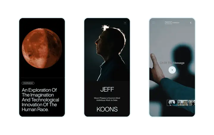
The story of Moon Phases was told in three parts: About the Artwork, which served as the landing page where viewers learned more about Mr. Koons’ inspiration behind Moon Phases and the details behind its components; the About the Project page, dedicated to a docuseries that offers in-depth content about the artworks and behind-the-scenes content; and lastly, the Explore the Artworks page, the “gallery” page that allowed viewers to take in each of the individual sculptures.
EMBODYING MOON PHASES
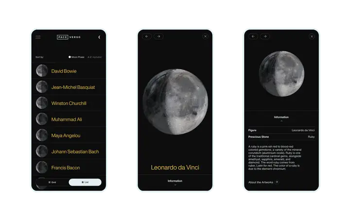
The site gallery pulled directly from the project, using the same typography and colors within its gridded gallery as the sculptures. Mr. Koons wanted to assign equal importance to each piece in the collection, so we built two view paths for viewers: a list view ordered by the historical figure each sculpture was made for, and a grid view laying out the full collection on a singular plane aligned to the lunar calendar.
technology
We had an extremely close working relationship with Pace and Jeff Koons, but we had full creative freedom over the development of the experience. Though we handled the build, our team was in constant communication with Pace and Mr. Koons for approvals.
And we weren’t just building a regular site—we were building a completely custom site for a completely new experience.
To deliver on the premium aesthetic, everything about this site had to be custom-made; something the average CMS technology doesn’t accommodate.
The site required fully bespoke content. So we built a custom engine that gave us absolute control of the features, functionality and movement of the site. Unlike common CMS technology, the custom engine freed us from the restrictions of a traditional site architecture.
With the anticipation of heavy assets, we needed a way to control what was rendered and its weight on the browser load.
We built the animations in CSS, and rendered them through our custom engine. This enabled fluid scrolling of the site, exactly how we wanted it.
We needed to ensure accessibility across devices and browser types.
We built our custom-render engine from the ground up to handle the huge amount of heavy assets simultaneously, and control various JS and CSS animations to maintain high frame rates for smooth scroll experiences across all devices.
Tempo
- Retail+eCommerce
Tempo
- Retail+eCommerce

