Murad
- Beauty+Cosmetics
- Retail+eCommerce
murad.com — An eCommerce redesign to help progress an iconic skincare brand.
View live siteChallenge
Murad is a clinical skincare company dedicated to helping patients look and feel better. As a pioneer in anti-aging and holistic care, the brand wanted a partner to help it stand out in the 21st century by appealing to a new generation of customers while maintaining its loyal brand following.
As part of its evolution, Murad looked to rebrand through an eCommerce transformation. The client challenged us to craft a new digital platform that brings forward the brand’s unique qualities while also providing an industry-leading shopping experience.
Approach
The new Murad brand and eCommerce platform combine the humanity of wellness with the cutting edge of today’s medical breakthroughs. The brand was rejuvenated through a new design language, friendly and approachable content, and an updated identity that is distinctly Murad.
To improve the customer experience, we designed various shopping utilities and reworked the navigation framework based on data-driven decisions. Additionally, we brought together skincare education, product information, and brand inspiration to balance Murad’s history in wellness with the needs of today’s audience.
Experience Design
We helped Murad craft an experience strategy built around three key objectives: facilitating product discovery, improving product and brand education, and enriching the customer journey.
Guiding navigation and facilitating product discovery.
Through research, we determined three categories of user intent: visiting the site to replenish a product they already own, visiting the site to address a current skin issue, or just browsing.
To reduce users’ confusion and help them find products and content, we completely overhauled the navigation and categorization of Murad’s products. Users can now filter by product type or solution. This approach allows users to obtain a holistic overview of the offerings with minimal effort.
A customer experience based on browsing behavior and intent.
For users looking to browse by solution, the page leverages contextual sticky elements that highlight categories and their details.
Conversely, for those looking for a specific type of product, the listing page interface adapts to populate filters for skin type, collection, product category, and formulation.
Encouraging product consideration and providing guidance to users.
When it comes to skincare, users have a hard time understanding what’s right for them. Based on this insight, we designed a quiz to help customers better understand their skin types and guide them to products and educational content that can help address their needs.
Driving conversion through utility and education.
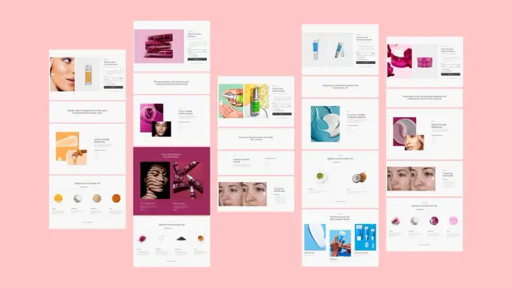
The new PDPs feature shopping tools that guide users to conversion. Each PDP is tailored to education based on specific product details, and we’ve implemented different functions that facilitate exploration, product bundling, and cross-promotion.
User Engagement
Baseline design principles are essential to any user experience, but stories, perspectives, and content give it meaning. We were tasked with building not only a frictionless experience but a purposeful one, as well.
Leveraging promotions as part of the brand narrative.
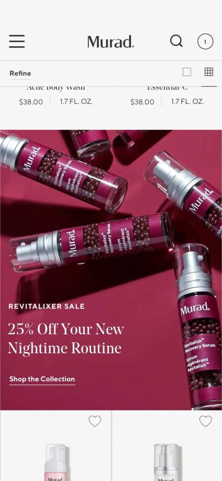
As we approached conversion within the redesign strategy, we wanted to continue using promotions in a way that didn’t challenge Murad’s premium positioning. This was achieved through applying a modular system throughout the site, as well as rules that govern how and when they appear.
Telling the brand story by revisiting Murad's origins.
The Murad team wanted to move the brand forward without abandoning its past, so we brought its beginnings front and center.
As founder, Dr. Howard Murad is an integral part of the Murad story, but many aren’t aware of his significance. By simplifying the navigation in our redesign, we gave the brand origin story prominence as a top-level menu item. From there, we redesigned the pages to illustrate a more cohesive and visually interesting narrative using an interactive layout, interspersing tips from Dr. Murad to subtly establish his presence throughout the experience.
Humanizing the brand by refreshing its art direction.
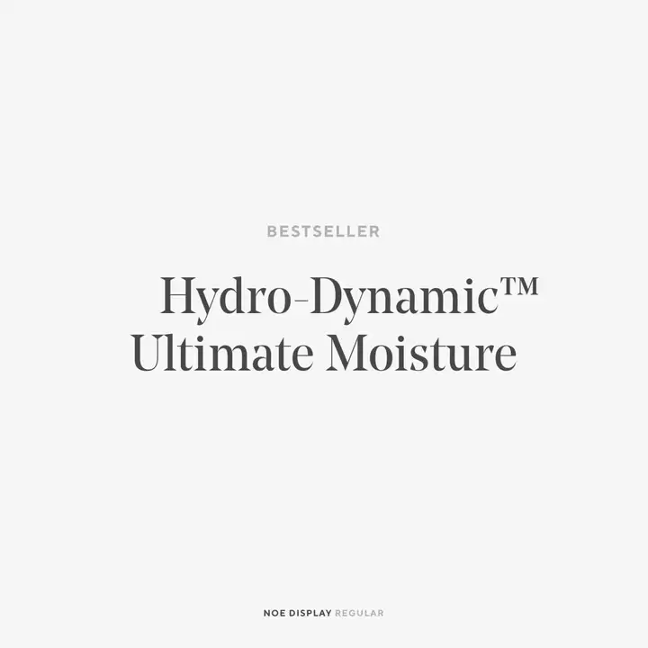
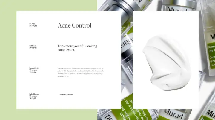
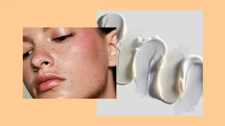
Our team leaned into warmer tones for the site's art direction, occasionally using gentler shades of white. We used a serif font Noe Display as the primary typeface to further the sense of friendliness that is rarely seen in designs throughout the industry.
Expediting time to market with consistent brand and content guidelines.
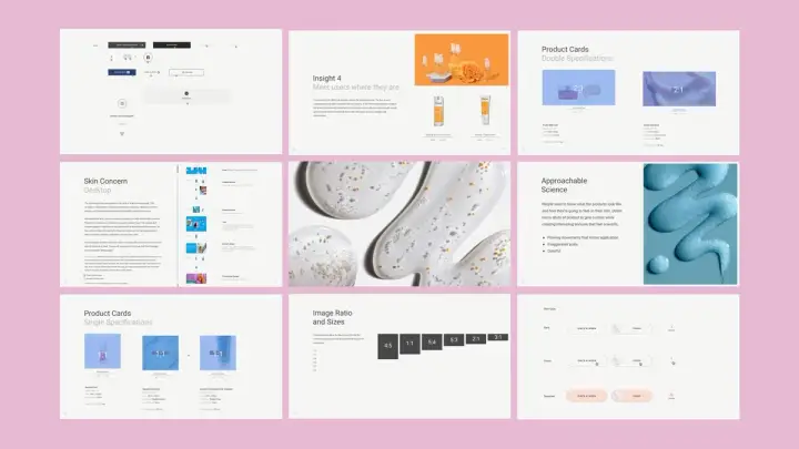
We put together a set of robust content guidelines that included aspect ratios for images, optimal character counts, descriptions of each module, and general design recommendations to facilitate the maintenance process for the client. This guide assisted in a seamless hand-off of work while sustaining the integrity of the original design.
HeathCeramics
- Retail+eCommerce
- HomeFurnishings
HeathCeramics
- Retail+eCommerce
- HomeFurnishings
