TheWebbyAwards
- Software+Technology
- DesignArchitecture
- B2B+ProfessionalServices

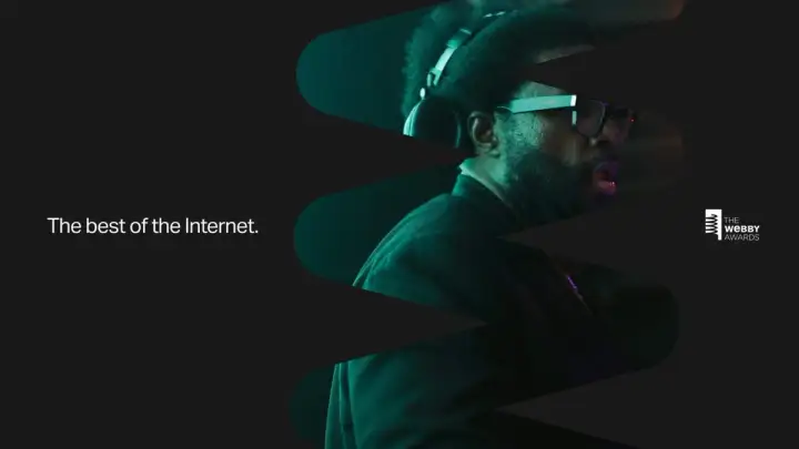
webbyawards.com — A product experience built for showcasing and researching the best of the Internet.
View live siteChallenge
Known as the “Internet’s highest honor,” The Webby Awards are the leading international award recognizing digital excellence. Founded in 1996 during the Web’s infancy, what started as a site with 15 categories is now a platform with 13,000 entries from nearly 70 countries worldwide.
As content and media formats across the Internet have grown, so has the volume of content and categories on the Webbys’ platform. Because of this, the site was in need of an overhaul to better reflect the best of the Internet. So, the Webby team engaged us to help the business transition from an award show to an online product that brings utility and inspiration to organizations across the globe.
Approach
Working in direct collaboration with The Webby Awards’ team, we completely overhauled the platform to establish a service strategy and product experience that unlocks additional revenue opportunities while delivering more value to users through improved utility, engagement, and versatility.
We took 17 years’ worth of data and built a product experience that turns what used to be merely a gallery of winners into a robust research tool for industry professionals. The new product experience introduces a design system that provides clarity and discoverability across categories, and enables users to go broad as well as narrow while engaging with content. The new experience strategy meets the unique needs of varying audience types through improved functionality, and the visual language has been adapted to define a new image for the Webbys’ brand across communications.
Service Strategy
While much of our engagement was focused on strengthening the Webbys’ eventual growth plan, the first phase of this project was dedicated to optimizing their current offerings. We set out to develop new key features for data collection and improve engagement, ultimately crafting an experience that serves as a best-in-class destination for online research and inspiration.
Through qualitative and quantitative research, we identified several insights. First, users needed better tools for discovery. Secondly, potential competition entrants struggled while researching submission categories. Lastly, across the board, there was an opportunity to connect related content through improved curation and site architecture.
Immersion, synthesis, and experience strategy.
To align on a shared vision, we kicked off our partnership by defining our experience strategy and immersing ourselves in the business. We looked at nearly two decades of data and conducted a series of audience and stakeholder interviews, allowing us to determine audience segments as well as identify insights to establish the best possible user experience.
Experience concepts and functional prototyping.
To stress-test ideas and get a feel for our strategy in context, we had functional prototypes within three weeks that we used to explore four potential solutions. Each prototype was based on different logic and experience principles, taking into consideration usability, flexibility, and functionality.
Developing a new design system.
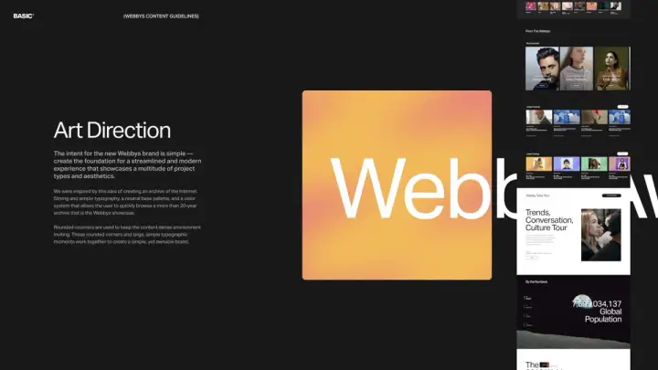
A platform like The Webby Awards needs a scalable design system that can act as a base for showcasing the world’s best work as well as the ability to stand on its own. We established a new visual language that is simple yet flexible enough to house various media types across owned and earned channels.
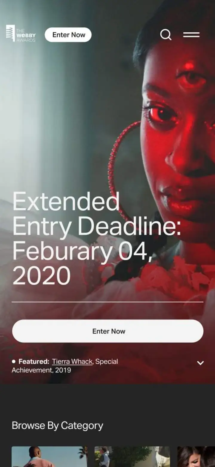
The juxtaposition of black and white continue to make up the base of the identity. In addition, to continue building brand equity around the Webbys’ iconic spiral, we now use it in both minimalist as well as abstract form to create visual interest, focus, and familiarity across touchpoints.
Delivering utility and personality through new design components.
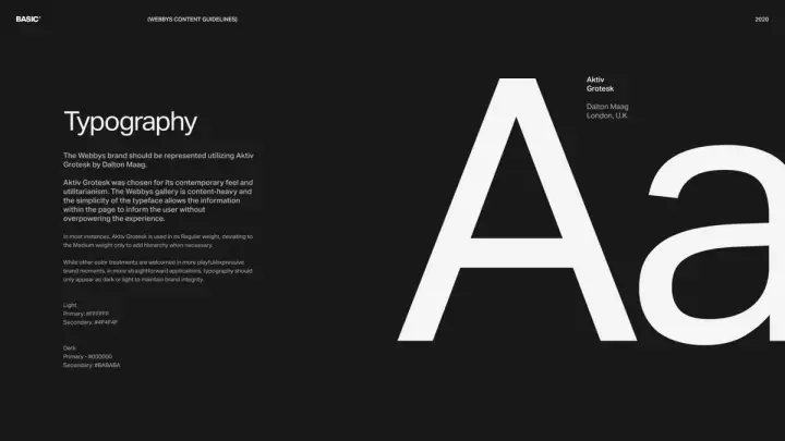
We established all-new UI components, typography, and a color strategy focused on bringing clarity as well as maintaining the personality of the program’s rich history. Rounded edges have been introduced to make the visual environment feel less dense and boxed in, specifically within gallery environments.
Supporting 17 years of evolving content and formats.
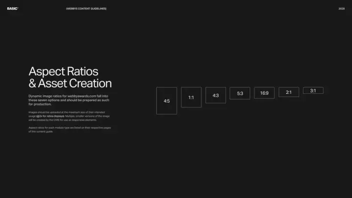
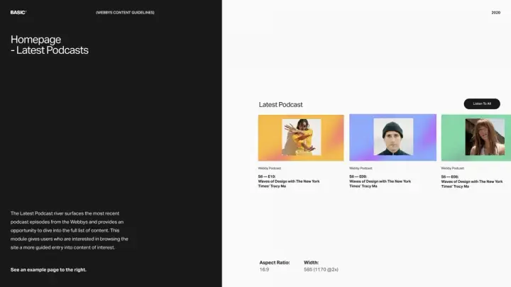
In order to push the experience forward and accommodate 17 years’ worth of images at a single aspect ratio, we added hierarchy to make the experience digestible and created a flexible tile system that allows the Webby team to utilize a variety of tile sizes without compromising design integrity.
Providing context and structure with color.
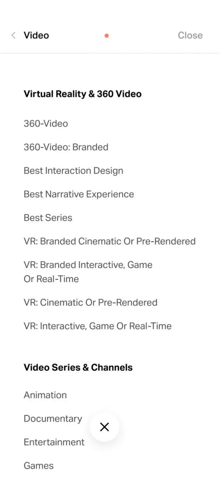
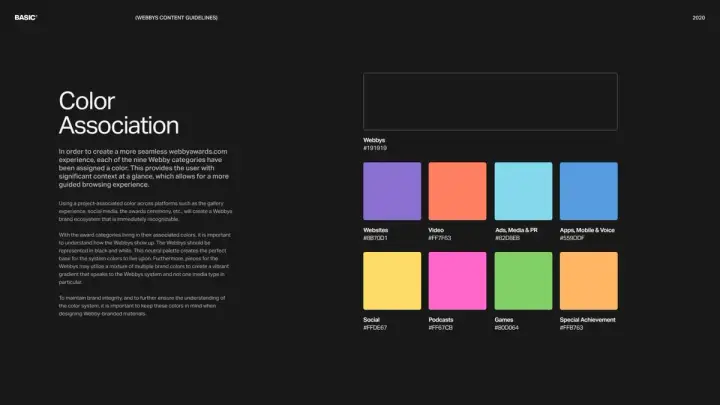
Due to the vastness of media types and categories on the platform, we introduced a branded color system to bring consistency and clarity to the experience. Acting as a visual cue, each color represents a specific media type to provide context while browsing and structure within categorical environments.
Experience Design
With millions of global visitors annually, the Webbys’ platform needed to put users first with a streamlined and intuitive browsing experience. Across audience segments, we identified a common theme—those coming to the platform were typically doing some form of research, whether looking for creative inspiration, recruiting, or searching for a new agency partner.
We optimized the site through functional and utility-centric design considerations, making research easier by connecting the dots for users.
Introducing a new architecture and navigation framework.
Research told us that users weren’t browsing across media types or categories on the old site despite this being a key motivation. The reason for this was a shallow gallery navigation that didn’t surface all category options for users. To solve this, we created a new navigation paradigm and browsing experience that keeps media types and categories exposed at all times within the winners gallery.
Improving search and filtration to deepen discoverability.
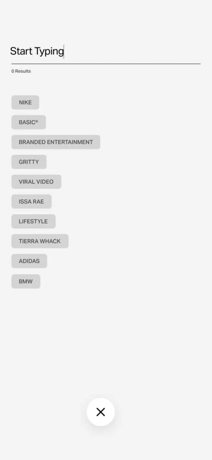
With an archive of content spanning everything from websites to podcasts to games, there was a need for a stronger search tool. In building this, we not only created a clear way to navigate content but also allowed our identified user segments to build out customized cross-sections of content through our new tagging and filtering system.
Unlocking additional utility through account creation.
The all-new account experience allows for deeper filtration as well as the ability to save and share inspiration. As users interact with the site and look to utilize these functions, a simple paywall and account creation unlock the new premium Webby Awards membership.
Restructuring media landing pages and category pages.
The gallery experience has been completely reimagined to help facilitate discovery in context. The hierarchy of the pages was restructured to better showcase and highlight the differences between winners, nominees, and honorees.
Reimagining winner pages.
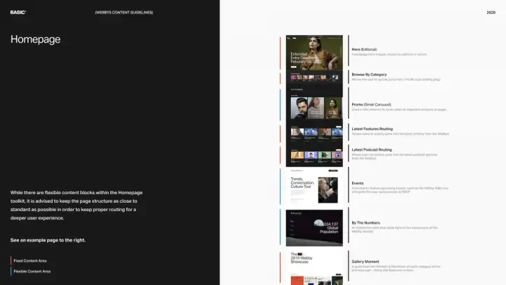
The new winner pages are structurally modular to support various content considerations, including where the work won, cross-related categories, credits, five-word speeches, and featured articles.
Brand Communication
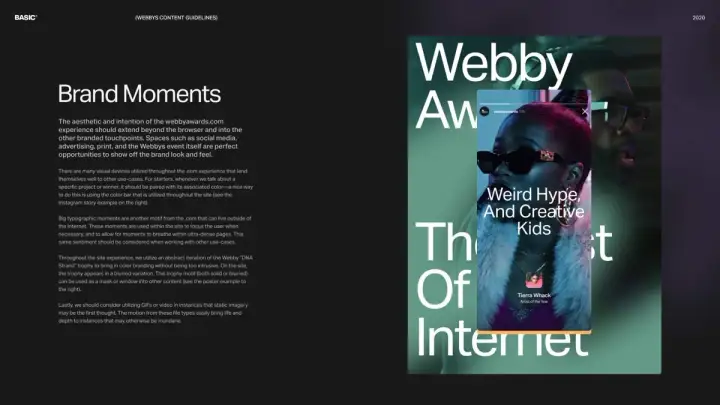
To create consistency across the holistic brand experience, we took our new design language and created additional touchpoints and guidelines for the Webbys’ marketing and communications team to use as they engage their audiences through digital channels and beyond.

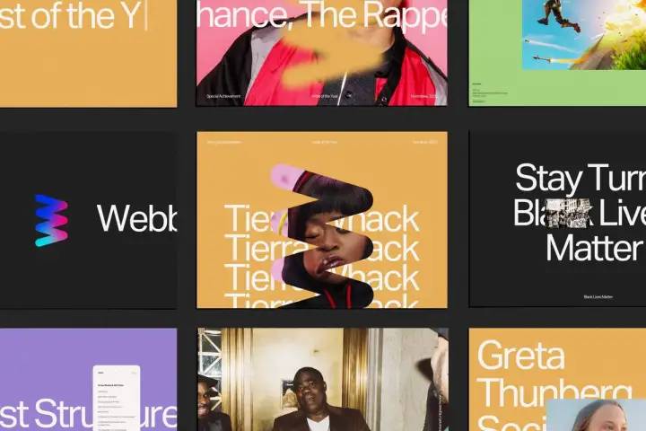
Building a social media toolkit of assets and guidelines.
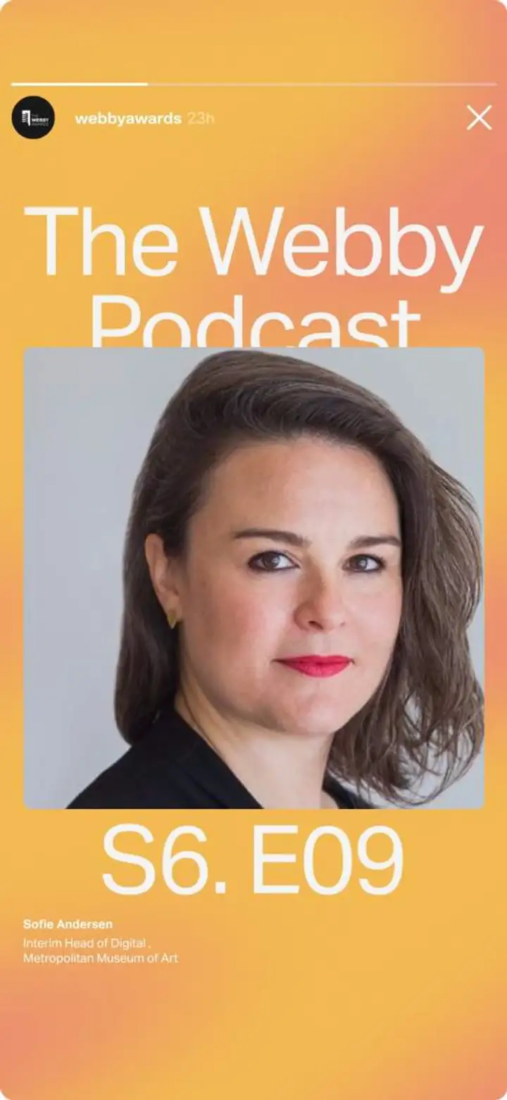
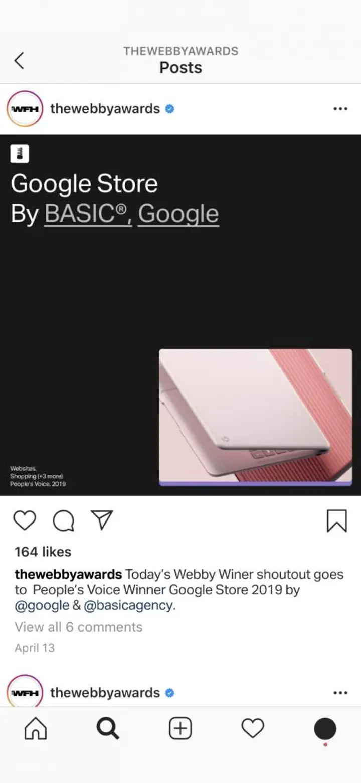
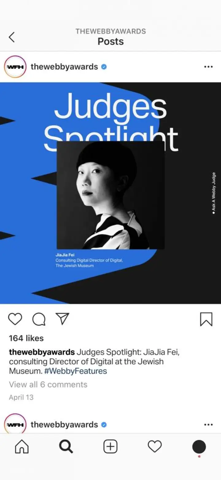
Being that The Webby Awards are a socially driven organization, we created a wide range of assets that streamline the creative process behind various communications, including templates for five-word speeches, winner announcements, show updates, and more.
DesktopMetal
- Electronics+Hardware
- Software+Technology
DesktopMetal
- Electronics+Hardware
- Software+Technology
