BreakingThroughtheBrandingBlahs●
How brands can tell their story in a way that’s unique and gets noticed.
Tech likes to talk. And we like to listen. Especially if someone invents those hoverboards from Back to the Future II.
However, as much as tech companies talk about standing out, they mostly kinda look the same.
The aesthetics and storytelling of tech advertising continues to look uncannily similar, to the point of parody: there’s the blatant overuse of the Corporate Memphis illustration trend and the Pythonesque ways tech companies name themselves.
Good news: it’s all good. Here are three innovative ways brands are breaking through the blahs of tech advertising.
GET ZIGGY WITH IT.
In the world of tech branding, there is an incredible whitespace to zig while most others zag.
Pink goo and insurance may have nothing in common—until recently. The New York-based home and renter’s insurance startup Lemonade sticks out in a crowded insurance tech marketplace because it uses the unconventional color pink to produce unique stories that create trust.
The imaginative Lemonade Instagram features videos and content that resemble the aesthetics and attitude of 80’s/90’s era Nickelodeon and MTV.
They work with a variety of artists, illustrators, and creators to show what they are all about—that your stuff is always “covered” and what certain random pop-culture items would cost to replace.
Their off-the-wall pink branding runs parallel with the unique way it does business: instead of profiting from insurance payouts that go unclaimed by customers, they take a flat fee out of your premium as the profit, and donate whatever money may be left to charities, after paying claims and expenses.
They can be authentically crazy with their branding because, well, their business model is unique as well. People get it. They’re not trying to be different. They just are. And it’s why Lemonade can tell you how much the replacement cost for a Bob Ross easel will be—with a (mostly) straight face.
PHONE IT IN.
Like baggy jeans and social anxiety, QR codes have made quite the comeback.
Just ask Avery Dennison, a materials science company that’s using the QR code to reinvent our relationship with clothing.
The concept is called “connected apparel.” These are clothes—like t-shirts or jerseys—with QR codes (sometimes disguised as logos/badges) sewn into the fabric, which fans can scan with their phones to access exclusive team content, collectibles, and other unique fan experiences.
Avery Dennison teamed up with the San Francisco 49ers on commemorative t-shirts honoring defensive tackle Bryant Young’s 2022 induction into the Pro Football Hall of Fame. Fans could easily scan a QR code on the back collar of the t-shirt to access online videos of Young’s Hall of Fame introduction as well as his career highlights.
Avery Dennison and others are expanding this idea to create customized jerseys and more one-of-a-kind sports moments with teams all over the world. Now that’s a home run!
GET TO KNOW THE LOCALS.
Even if your product is one-size-fits-all, that doesn’t mean your branding has to be.
Spotify has become the most popular streaming music service thanks to a fun, intuitive interface, an extensive catalog, and Spotify Wrapped—which has become more shareable than unsolicited opinions.
However, the thing that really makes Spotify stand out is using localization to build a strong presence in different markets, often by promoting local artists and music genres. For example, Spotify created a playlist and a campaign called "Viva Latino" that showcases Latin American artists.
Spotify has also been known to have fun advertising campaigns that play off the personalization and vastness of their playlists including the hyper-local campaign "There's A Playlist For That" that highlights the platform's extensive library of Indian music. The campaign fully tapped into Indian culture, including a humorous nod to the “Keep Calm” playlist when stuck on the Tulsi Pipe—a stretch of road where a relaxing playlist would definitely be of help.
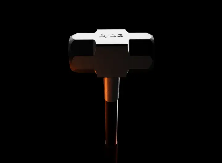
IN CONCLUSION: SLEDGEHAMMER
The world of tech advertising changed the moment a sledgehammer wielded by a punk-haired heroine crashed into Big Brother in Apple’s iconic “1984” ad.
Apple continued the sledgehammer’s momentum and became the gold standard. They do this with brand messaging that tells stories which evoke strong emotions, such as how an iPhone’s features can help solidify the love between a mother and son, or help a cyclist crush it on rainy streets. By creating emotional connections, Apple is able to build a deeper relationship with its customers.
IBM, the largest seller of home computers in 1984—aka, the ‘Big Brother’ in the aforementioned commercial—stopped selling home computers almost 20 years ago, while Apple became the world’s first $1 trillion (and $2 trillion) company.
In a market that gets even more crowded and competitive by the day, inspired branding and creative advertising are essential to stand out and succeed. Which can ultimately lead to increased sales, market share, and being written about in articles like this.
Be unique. Get local. Use the phone. Break through the blahs. In a world of screwdrivers, be the brand that’s a freaking sledgehammer.
BEHIND THE BASIC BYLINE: JOHN O’TOOLE
Hi, my name is John.
I've written copy for a variety of clients within the tech space—from startups to Google. Currently, I’m a Senior Copywriter at BASIC/DEPT®.
Blah, blah, blah. Let’s get on with it.
I wrote this article because my pessimistically optimistic worldview allows me to see things as they are—and what they could be.
I am endlessly fascinated with the ever-changing technology advances in our world. But can’t fathom how these tech companies’ advertising and branding efforts don’t receive the love their products and services do.
As someone who is also looking for ways to stand out in my creative writing and copywriting—I felt like I had to say something.
